I thought Apple’s new iPad ad was great when I first watched it. I was wrong
The crushing weight of creative nostalgia in the era of AI.
I began my creative career the same year Apple released their first and most famous Super Bowl commercial, "1984."
The impact of that first ad cannot be overstated: The Ridley Scott-directed spot’s depiction of bright idealistic individuality against stifling gray conformity is widely regarded as one of the greatest commercials ever made. It’s also the first of a series of great Apple ads, including “Think Different,” the iPod "Silhouette", and Mac vs. PC series.
Now, forty years later, I am writing about Apple's latest ad for the iPad, "Crush! | iPad Pro."
I think it's safe to say that unlike "1984," "Crush" will not be considered one of the best ads ever made, or even one of the best ads made by Apple. On the contrary, it seems likely to be judged as, if not one of the worst, then at least one of the most tone-deaf—so much so that Apple has already apologized for it.
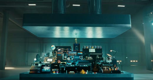
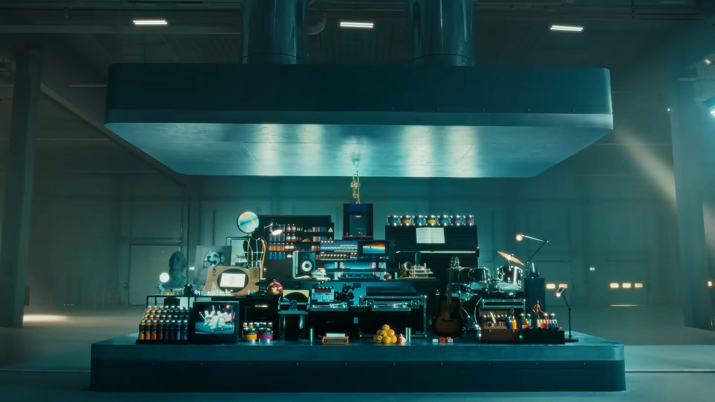
When I first saw “Crush,” I understood that watching soulful creative objects like camera lenses, an arcade game machine, musical instruments, a drafting table, and even a white Anglepoise lamp (sorry, Pixar) collectively pulverized into a digital tablet may irritate and offend some viewers, especially those working in creative industries. Nevertheless, I still liked the ad.
I liked it because the ad's premise was pretty straightforward: The powerful new iPad has all the creative tools you'll ever need. I appreciated that Apple filmed a gigantic hydraulic press crushing the actual items to drive the point home; they hadn't used digital effects or, heaven forbid, AI.
But perhaps, most importantly, the ad connected with me because I still remember using real cameras, shooting film, and painting with paint. I still do all those things today, but now I'm doing them using Apple products: iPhone for photography, iPad for drawing (though admittedly, I still also use a notebook and pencil), and Apple Mac for everything else.
Over the course of my career, I've literally shifted 99% of my creative work from analog to digital. I genuinely feel empowered by that change and rarely feel any nostalgia for my old ways of working. But if the broad reaction to this ad is anything to go by, I am clearly in the minority.
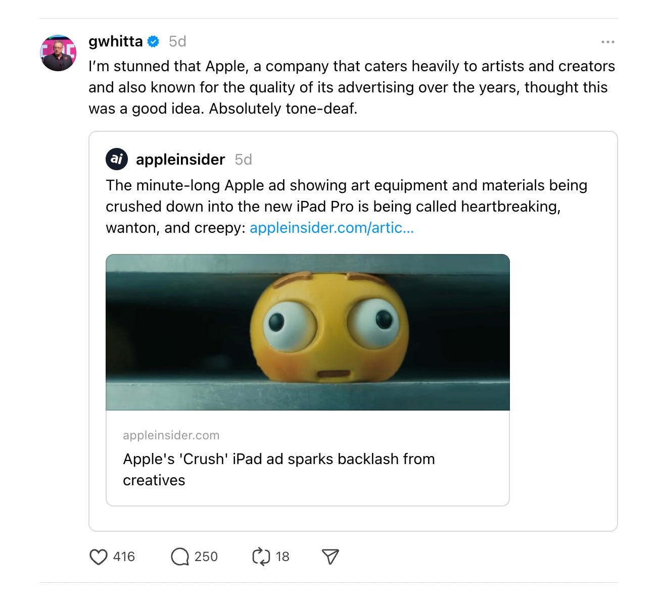
When "Crush" first dropped, articles in the press and posts on social media were, well, bad. Many drew a parallel between the ad and a vision of AI "crushing" artists, musicians, photographers, and filmmakers. People also saw the ad as a visualization of AI's threat to the creative industry itself—which I found somewhat ironic for all the reasons I mentioned earlier.
The consensus seemed to be that Apple was turning on the very creatives the company had actively courted for decades, offending many of the people who have been loyal customers from day one; a betrayal of the principles that Steve Jobs had espoused when he said, "It's in Apple's DNA that technology alone is not enough. It's technology married with liberal arts, married with the humanities, that yields the results that make our hearts sing."
Clearly, many people's hearts weren't singing while watching the latest iPad ad, which made me wonder why I was so blind to an interpretation that seemed so obvious to so many. How could I be so wrong?
I have an answer or at least a theory: In a word, I am older.
I am old enough to have created my first computer animation at art college using graph paper to plot coordinates to draw a line on a CRT monitor. When I later dropped out of art school in 1984 to begin work as a commercial illustrator, I painted using watercolors and acrylics for my paintings and pencils and charcoal for my drawings.
In 1988, I pivoted my career to become a photographer. I spent decades of my career shooting both negative and chrome photographic film — the stress of waiting at the lab for the shot film to be processed successfully and knowing with certainty that all the photos had come out still gives me nightmares to this day. I'm not kidding; shooting with film was utterly terrifying when your financial livelihood depended upon it. This fear was one of the main reasons I switched to shooting with a digital camera as early as I did.
Another less paranoid reason for switching was simply because I loved technology in general and Apple in particular. The moment I bought my first Mac, a second-hand Apple Macintosh Classic II, in 1992, I felt I was living in the future; I had access to a digital canvas on which anything could happen. Even though it took many years for that to become a reality, I still feel that same sense of excitement and optimism about technology in the creative industry. I love the fact that the only camera I use is my iPhone.
But the furor over the iPad ad has made me realize that I am entirely out of step with a great many of the younger creatives in this industry, particularly those for whom using computers and iPads is nothing new. And to be fair, Apple is also a much different company than when I bought my first Mac Classic all those years ago. My love and appreciation of the company dates back to even earlier, when there were two Steves, and even during the wilderness NeXT / Scully era, and rekindled as Jobs returned to stand on stage and profoundly show off the iPod with "a thousand songs in your pocket."
This ad was made by a company that's not afraid of its future for an audience that can barely see one that's viable.
I suspect younger generations don't see Apple as I did 40 years ago: as a bunch of idealistic punk pirates with a love of art and the humanities who used their innovative technology to make the most sophisticated creative tools ever imagined and empower a new generation to overcome the power of the legacy gatekeepers and democratize the entire creative industry in the process. Instead, they see Apple as a trillion-dollar behemoth with nearly monopolistic control threatening to unleash AI and literally crush their creative careers and dreams.
And now that I've had more time to think about it, they may have a point.
To be clear, I am not saying that "Crush" is a bad ad. It's not: it's the right ad for Apple, but the wrong one for the intended audience. This ad is the perfect visualization of, in the words of Joni Mitchell, "You don't know what you've got til it's gone." It's also evocative of a very different Apple than the one I knew when I began my creative career.
It's not just the ad, mind you. Commercial missteps come and go, and that's true here: You won't see millions abandon their iPhones, iPads, or MacBooks because someone in Apple's creative agency decided to rent an industrial press and crush some paint cans and rubber emojis.
But what "Crush" does represent is a company mistakenly looking at its audience and thinking that this idea is something they'll identify with and appreciate when the exact opposite is true. This ad was made by a company that's not afraid of its future for an audience that can barely see one that's viable.
When the ad first dropped, and I saw the reaction online, I thought people were taking it way too literally. But on reflection, I now realize that the literal is the point: If you're worried about your art, your career, and your future potential being crushed by technology and AI, then seeing those fears visualized in glorious "shot on iPhone" HDR by the one technology company that prides itself on its creative credentials has to sting a little.
Apple got it completely wrong; if I'm honest, so did I.
Which gives me some hope. The fact that Apple has apologized for this misstep makes me wonder whether "Crush! | iPad Pro" may ultimately benefit those who found it so understandably offensive.
I hope that with WWDC a few weeks away, Apple will use some of the remaining time to reconsider the potential negative impact on their users from the headlong rush of the AI arms race.
Perhaps now is the perfect time to rewrite their presentations to be a little more empathetic and more respectful of their audience's fears and concerns about what a future of artificial intelligence in the field of creativity means in reality.


It seems Apple’s “Crush” iPad ad is not only tone-deaf, it’s also a near shot-by-shot copy of a 2008 ad for LG in the UK. Yes, it may just be a coincide but regardless, it’s not a great look for Apple youtube.com/watch?v=NcUAQ2i5Tfo