The Wild Robot is 'painted by hand' animation at its absolute best
Proof that "real" does not necessarily mean more realistic.
One of my favorite animated films of all time is Disney’s Lilo & Stitch.
First released in 2002 and directed by Chris Sanders, Lilo & Stitch is remarkable not only for the wonderful character development (who doesn't love Stitch?) and touching script (“Ohana”) but also for its beautiful animation style: The backgrounds are all painted with watercolors, the last Disney to use this technique was Dumbo made in 1941. The land and seascapes of Hawaii are soft and textural—the surface of the watercolor paper is often clearly visible—and are painted with vibrant, warm colors inspired by the Hawaiian sunlight. The spaceships, alien technology, and even the aliens themselves have an almost inflated, balloon-like appearance; the laser blasts have a Splatoon-esque gloopy feel to them.
Perhaps most notably, CGI—which was so prevalent in the other Disney movies of the time—is used sparingly and never detracts from the hand-painted aspects of the movie. Lilo & Stitch is not only funny, charming, and poignant; it is also a wonderfully creative piece of “handmade” cinematic art.
And now, 22 years later, The Wild Robot picks up where Lilo & Stitch left off.
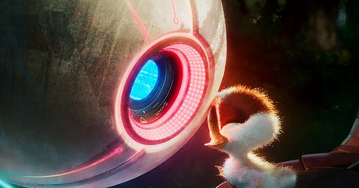
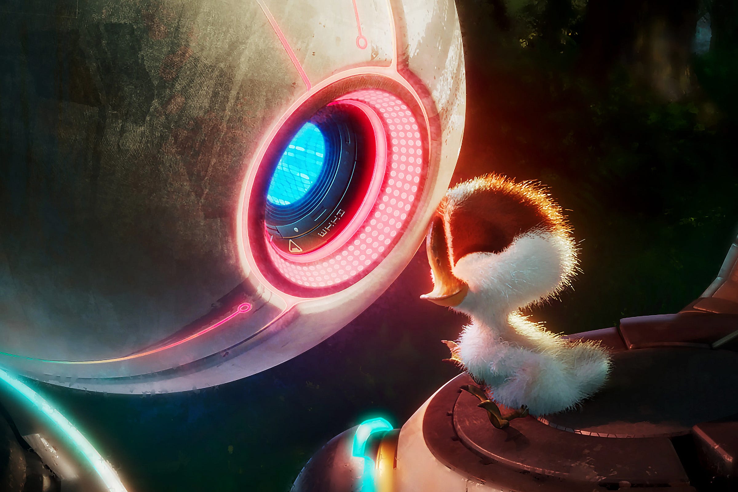
Based on the best-selling books written and illustrated by Peter Brown and notably also directed by Chris Sanders, The Wild Robot is an astonishingly beautiful piece of animated storytelling that pushes the “hand-painted” aesthetic of Lilo & Stitch still further. Sanders and his team have taken the digitally painted sketch style commonly reserved purely for concept art and fused it with CGI to create an animated style that is beguilingly realistic while retaining an intrinsic sense of imperfect human artistry.
As an avid collector of art books for animated movies and video games (my copy of The Art of The Wild Robot arrived yesterday), I have often been disappointed that the vibrancy and emotion found in the concept sketches often seems diluted and diminished when transformed into a photorealistic CGI animation by comparison. You only have to look at the concept art for Pixar’s Wall-E and Luca to see exactly what I mean. Even though I find both of these movies a joy to watch, the computer-y-ness of the animation tends to be more impressive than emotional for me.
Yet, The Wild Robot is both emotional and utterly gorgeous to look at. The movie proves—just as Lilo & Stitch demonstrated over twenty years ago—that animation doesn’t need to look real to be realistic.
It’s a simple approach that takes a tremendous amount of work (and technical innovation) to pull off. As Sanders explained in his interview with Petrana Radulovic at Polygon:
We could no longer wrap geometry with textures, which is what we’ve been doing in CG from the very beginning. We need the hand-painted look everywhere. Not just in the sky, but on the ground and in the trees, in bushes and flowers and everything. So that’s what they did. They found a way to paint dimensionally. So there is no geometry in the film, except for the characters. And even the characters have painted surfaces.
As Sanders also points out in his interview with Polygon, three of the top ten box-office movies of 2024 are animated: Despicable Me 4, Kung Fu Panda 4, and Pixar’s Inside Out 2.
Apart from all being sequels, all three also share the current en vogue, hyper-realistic computer-y renditions of their respective stylized worlds. Of the three, I have only seen Pixar’s Inside Out 2. I adored the original Inside Out, and though the writing of the sequel is just as good as the first, and the depictions of the new emotions (Anxiety, Embarrassment, Envy, and Ennui) extremely clever (and funny), what is most remarkable from a creative perspective is the realism of Riley’s expressions; there are times when even though her character is a computerized cartoon, she looks like a real teenager. It’s uncanny.
Yet, just like Woody and Buzz get “better” in each version of Toy Story, so too have Riley’s expressions become more sophisticated and “real” between Inside Out 1 and its sequel; she’s been upscaled. Just like the resolution of the backgrounds and characters in video games seem to get better every year (or with each new generation of console), so too with animation, it seems.
All of which makes the aesthetic of The Wild Robot more remarkable. It is deliberately less “real" (in the comparative sense) and less “detailed” (in the technical sense) than any other animated movie of recent years that I can think of. Its entire visual style is moving against the tide. And I applaud it.
Inside Out 2 was a huge hit and is arguably a strong contender for this year’s Oscar. I honestly have no idea whether The Wild Robot will have the same box office or awards impact. (FWIW, Universal is campaigning for nine categories for the film—up to and including best picture.) Regardless, from a purely creative point of view, and especially from a human creative point of view, The Wild Robot is the most significant animated movie in years.
In Radulovic’s interview with Sanders, she asks the question, “Where do you most want to see animation go in the future?” His reply: “I’d love to see it go in all sorts of directions. We finally escaped the gravitational pull of planet CG, and I feel like we’re all free to maneuver.”
I hope he’s right. But whatever comes next in animation, wherever we go from here, as it stands right now, The Wild Robot is an absolute masterpiece.


